
How to Interpret GSEA Results Without Fooling Yourself
If you've spent any time with transcriptomic data, you've probably come across Gene Set Enrichment Analysis. It's one of the standard tools in the field, and for good reason. Instead of asking whether individual genes change in a big way, GSEA asks a more interesting question: are whole groups of related genes moving together?
It's a powerful approach, and it's also one of the most routinely misinterpreted. We've all seen papers claim a pathway is 'activated' just because the GSEA plot looked dramatic. Biology doesn't really work like that, though.
So here's the goal of this guide: walk you through what GSEA actually tells you, what each number means, and where people go wrong when they read their own results.
Why Use GSEA Instead of Looking at Individual Genes?
Old-school differential expression looks at one gene at a time. That works fine for a transcript that's strongly regulated, but most biological processes aren't driven by a single gene. Signalling pathways usually involve dozens or hundreds of genes, each one only nudging up or down by a little.
Picture an inflammatory response where 80 NF-κB target genes each go up by 20%. Look at any one of them in isolation and most won't even clear statistical significance. Look at them together, though, and you can see a coordinated programme hiding in plain sight.
That's exactly the kind of signal GSEA is built to pick up.
Rather than testing genes one by one, GSEA checks whether the members of a predefined gene set are clustering near the top or bottom of a ranked list.
That tends to be way more informative than just counting how many genes made the cut.
Step 1: Start With the Ranked Gene List
Everything in GSEA begins with a ranked list of genes.
- log2 fold change
- Wald statistic
- t statistic
- signal-to-noise ratio
- moderated t statistic (limma)
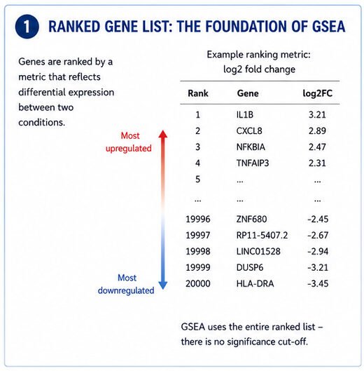
The genes that went up the most in your experiment end up at one end of the list, and the ones that went down the most land at the other.
GSEA uses the whole ranked list, top to bottom. There's no arbitrary cut-off based on adjusted P-values, which is honestly one of the best things about the method.
Step 2: Understanding the Enrichment Plot
You know the figure. The colourful one with the green curve and the little black bars.
It has three parts worth understanding:
The green line
This is the running enrichment score. As GSEA walks down the ranked gene list, the score goes up every time it hits a gene in your pathway and down when it hits a gene that isn't.
- the score increases whenever it encounters a gene belonging to the pathway
- the score decreases when genes are absent from the pathway
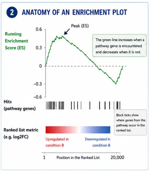
If most of the pathway's genes are clustered near the top of the list, the green curve climbs sharply at first, then drifts back toward zero.
If they're bunched at the bottom instead, the curve drops below zero.
The highest point, or lowest point, is the enrichment score.
The black tick marks
Each vertical line marks the position of a pathway gene within the ranked list.
Closely clustered tick marks indicate coordinated regulation.
Widely scattered tick marks suggest little evidence for enrichment.
The colour bar
Most software colours the ranked list from red to blue.
- red = genes increased in your experimental condition
- blue = genes decreased
That colour bar tells you right away whether the enriched pathway is associated with genes that went up or genes that went down.
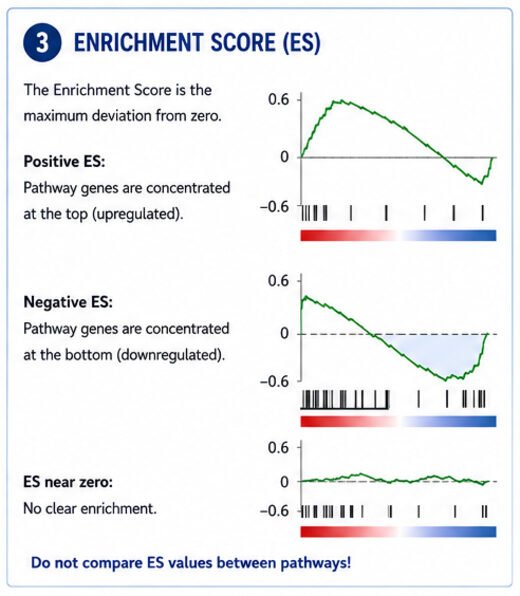
Step 3: What Does the Enrichment Score Mean?
The enrichment score (ES) is just the biggest deviation from zero that the running score hits during the walk.
Large positive ES
Most pathway genes occur near the top.
Large negative ES
Most pathway genes occur near the bottom.
An ES close to zero means the pathway's genes are scattered all over the ranked list with no real pattern.
But here's the catch
Don't compare enrichment scores directly between pathways.
A big pathway and a small one produce completely different score distributions, so the numbers aren't on the same scale.
That's what the Normalized Enrichment Score is for.
Step 4: The Normalized Enrichment Score (NES)
The NES is probably the most useful single number GSEA reports. It adjusts the enrichment score for gene-set size, which means you can actually compare pathways against each other.
It corrects the enrichment score for differences in gene set size.
Now you've got something you can compare across pathways.
- NES around ±1 Weak enrichment
- NES around ±2 Strong enrichment
- NES above ±3 Very strong enrichment (although uncommon)
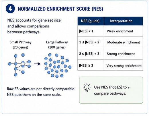
Don't forget that biological significance matters as much as statistical significance. A pathway with NES = 2.1 that lines up perfectly with your experimental model is usually way more interesting than a random pathway with NES = 3.5.
A pathway with NES = 2.1 that perfectly fits your experimental model is often far more interesting than an unrelated pathway with NES = 3.5.
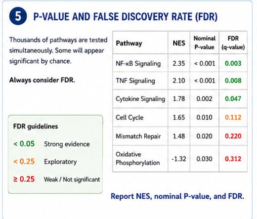
Step 5: The P-value Isn't Enough
Newcomers almost always jump straight to the P-value.
Don't.
GSEA is running thousands of pathway tests at the same time.
Some of those will look significant just by chance.
That's why the False Discovery Rate (FDR) is usually the number you should actually look at.
- FDR < 0.25
- Original Broad Institute recommendation for exploratory analyses
- FDR < 0.05
- Much more stringent and increasingly expected in high-quality publications
- NES
- nominal P-value
- FDR
- Reporting only the nominal P-value is a bad habit. Report all three
Step 6: Leading Edge Analysis
The leading-edge output is one of the most useful parts of GSEA, and most people skip it.
The leading-edge subset is the set of genes that actually produced the enrichment score.
These are the genes driving the signal.
Instead of staring at a pathway with 200 genes, you might find that only 18 of them are doing the work.
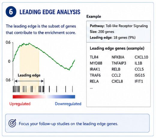
- qPCR validation
- Western blotting
- CRISPR knockouts
- mechanistic studies
- biomarker development
- Think of the leading edge as the engine of the pathway
Step 7: Don't Say a Pathway Is Activated
This is probably the single most common mistake in published papers.
GSEA doesn't measure pathway activity.
It measures coordinated changes in the expression of pathway-associated genes.
Say you see enrichment of the MAPK signalling pathway. That doesn't mean MAPK kinase activity has gone up.
Kinase activity depends upon
phosphorylation
localisation
protein abundance
scaffold interactions
phosphatase activity
RNA-seq can't see any of that.
"Genes associated with MAPK signalling were enriched."
"MAPK-related transcriptional programmes were upregulated."
"The data are consistent with altered MAPK signalling."
Don't claim direct pathway activation unless you have independent biochemical evidence to back it up.
Step 8: Watch Out for Redundant Pathways
Big pathway databases have a lot of overlap.
- TNF signalling
- NF-κB signalling
- inflammatory response
- cytokine signalling
- innate immune activation
- They share a lot of the same genes
If all five of those come up enriched, that doesn't really mean you've found five separate biological findings.
Look for the shared theme running through them.
A lot of researchers cluster related pathways into broader biological processes before they start interpreting anything. It cleans up the picture considerably.
Step 9: Validate the Biology
GSEA generates hypotheses.
It almost never proves mechanisms.
The strongest studies back GSEA up with extra experiments:
qPCR
protein expression
phosphoproteomics
reporter assays
functional assays
knockdown or knockout studies
If GSEA flags an inflammatory programme, go validate the key cytokines or signalling proteins in the lab. Don't just take the plot at face value.
Bioinformatics should guide your experiments, not replace them.
Common Interpretation Mistakes
Same mistakes keep showing up in published work:
- Interpreting enrichment as proof of pathway activation.
- Ignoring the FDR while highlighting nominally significant pathways.
- Over-interpreting pathways with very small leading-edge subsets.
- Focusing only on pathway names without examining the genes driving enrichment.
- Comparing raw enrichment scores between pathways instead of normalized enrichment scores.
- Treating overlapping pathways as independent discoveries.
- Ignoring whether the enriched biology makes sense in the context of the experiment.
Final Thoughts
GSEA is useful because it pulls your focus away from individual genes and toward coordinated biological programmes. Read it carefully and it can pick up subtle changes that a standard differential expression analysis would miss.
But the method is only as good as the person reading it. Don't fall into the trap of equating enrichment with pathway activation. Pay attention to the NES and the FDR, and always look at which leading-edge genes are driving the signal. Remember that transcriptomic data give you hypotheses, not mechanistic conclusions. The most convincing papers use GSEA to flag candidate pathways, then go validate them experimentally.
Used that way, GSEA stops being just a pretty plot and starts being a useful bridge between your sequencing data and the biology you're trying to understand.