Melt curve analysis (qPCR)
Melt analysis after SYBR Green qPCR tells you whether your product melted at one temperature or several — a quick check on specificity before you trust the Cq. Many researchers skip melt curve analysis entirely, yet it is one of the skills that separates routine data collection from reliable interpretation. At first glance, the post-PCR melt curve can look like an afterthought; in reality it reports on reaction specificity, product purity, and subtle amplification artifacts.
What a melt curve actually measures
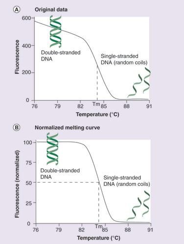
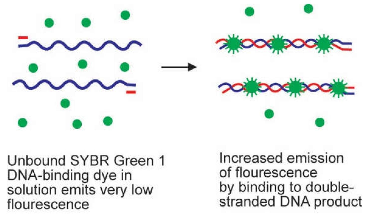
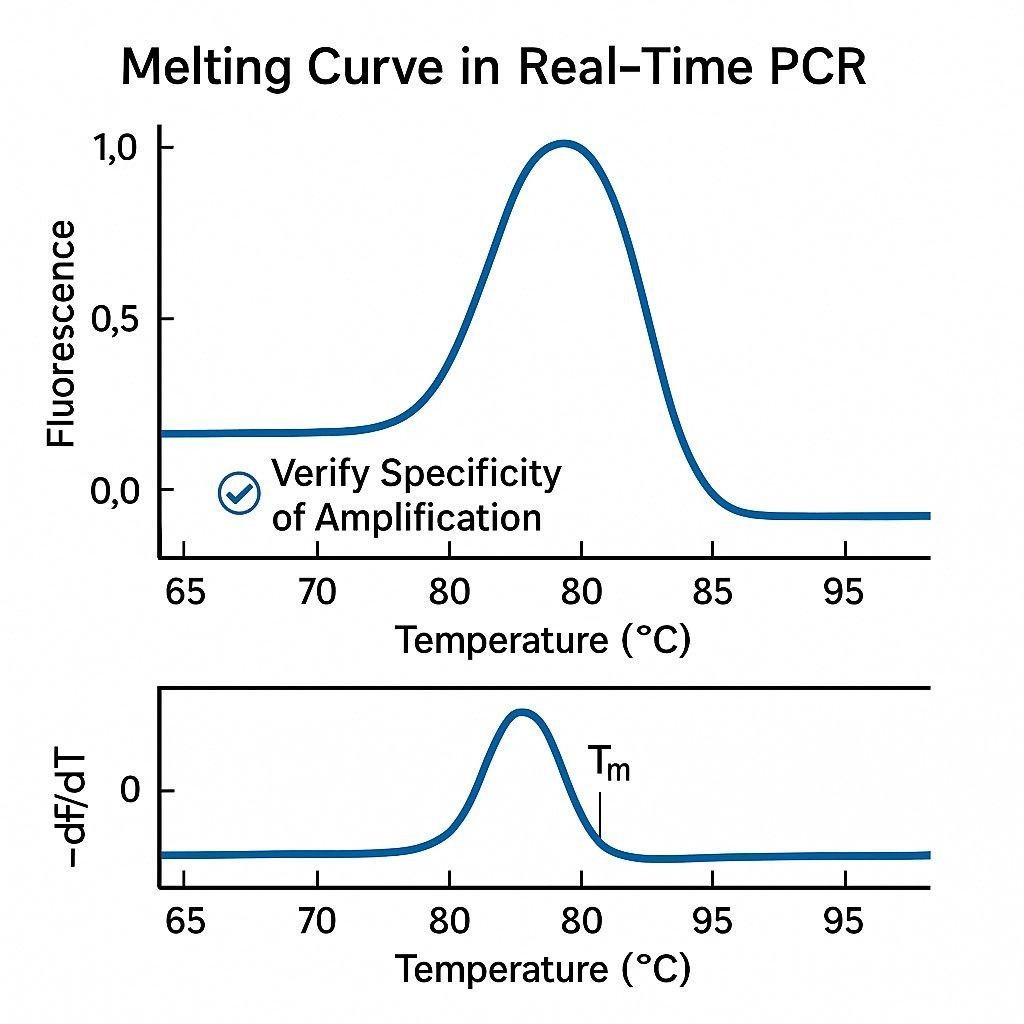
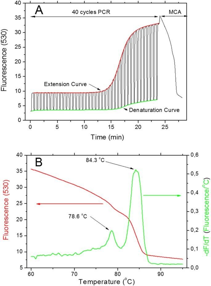
At the end of a SYBR Green qPCR run, the instrument gradually increases the temperature of the reaction while continuously measuring fluorescence. SYBR Green binds specifically to double-stranded DNA (dsDNA), emitting strong fluorescence when intercalated. As the temperature rises, the DNA strands of the PCR product—made during the amplification cycles—begin to separate, or “melt”, into single strands. When this happens, SYBR Green is released and fluorescence drops rapidly.
The result is a smooth fluorescence decay curve, which is typically transformed into a derivative plot (−dF/dT vs temperature). This derivative representation sharpens transitions and produces distinct peaks corresponding to melting events. Think of it as the rate of change of the fluorescent signal.
Each peak represents a population of DNA molecules with a specific melting temperature (Tm), which is influenced by sequence length, GC content, and complementarity.
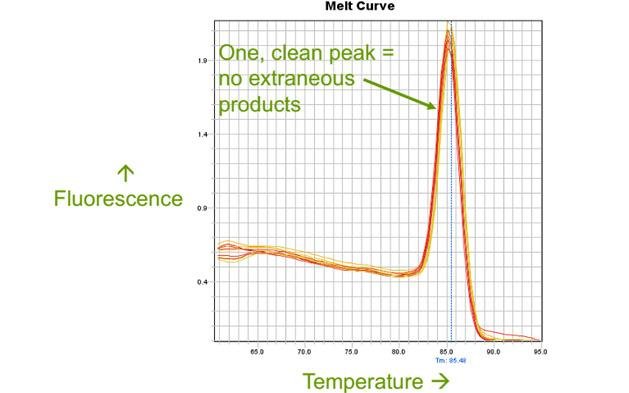
The ideal outcome: a single, sharp peak
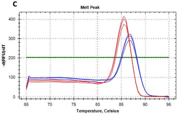
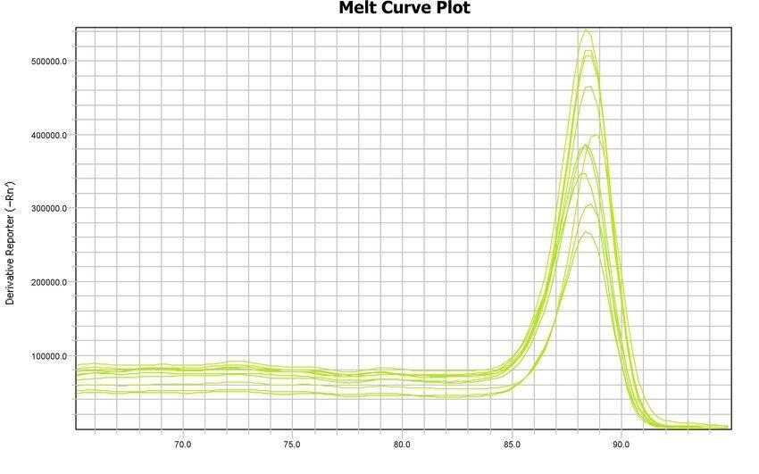
In a well-optimized qPCR assay, the melt curve should show a single, narrow, symmetrical peak. This indicates that only one DNA species has been amplified—hopefully your intended target.
A sharp peak often reflects a homogeneous population of amplicons with identical sequence and length. The temperature at the peak maximum is the melting temperature (Tm), a characteristic property of that specific PCR product. Remember that two factors influence melting temperature in a qPCR reaction: length and sequence. In theory, two totally different PCR products with different lengths could give the same melt curve peak—a long product that is AT-rich and a shorter product that is GC-rich. However, this is unlikely to occur.
Consistency of this peak across replicates reinforces confidence in both primer design and reaction conditions.
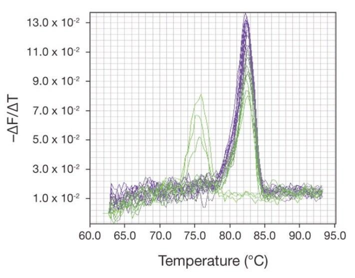
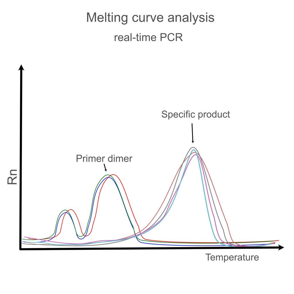
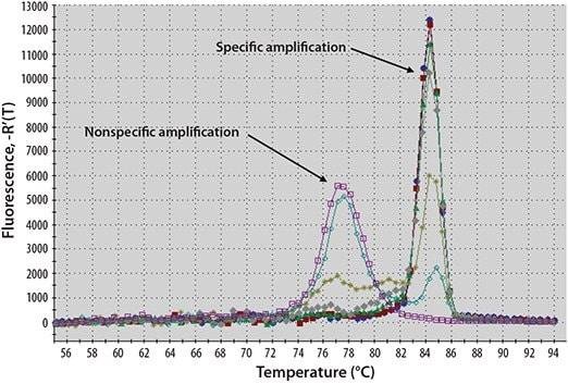
Multiple peaks: evidence of non-specific amplification
When more than one peak appears, the reaction has produced multiple DNA species. This is one of the most common issues encountered in SYBR Green assays.
A second peak at a lower temperature often indicates primer-dimer formation—short, non-specific products that melt more easily. Larger non-specific amplicons may produce additional peaks at different temperatures depending on their sequence composition.
The presence of multiple peaks complicates quantification, as SYBR Green cannot distinguish between desired and undesired products. In such cases, Ct values become less reliable because fluorescence includes contributions from all dsDNA present. In effect you are quantifying all of the PCR products together.

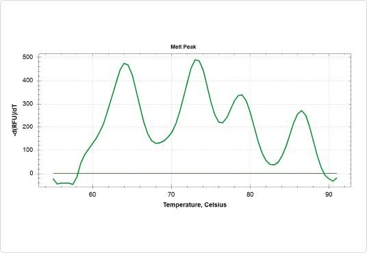
Broad or asymmetric peaks: subtle heterogeneity
Not all problems are obvious. Sometimes the melt curve shows a single peak, but it is unusually broad or slightly asymmetric, with a shoulder on one side.
This often suggests a mixture of very similar products—perhaps splice variants, closely related gene family members, or partially mismatched amplification products. Because their melting temperatures are close, they merge into a single, distorted peak rather than forming clearly separated ones.
Such patterns require careful interpretation, especially in experiments where specificity is critical, such as gene expression studies involving homologous sequences.

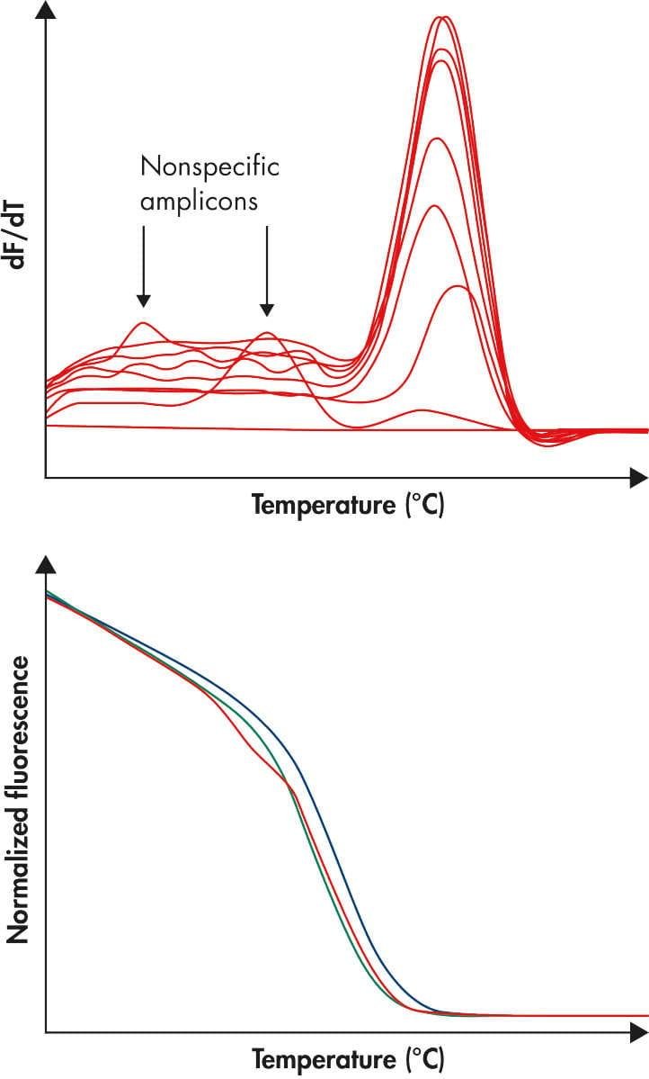
Primer dimers: the low-temperature signature
Primer dimers are a frequent nuisance, particularly in reactions with low template concentration. They typically appear as small peaks at lower temperatures (often 65“75 °C, though this varies).
Because primer dimers are short and less stable, they melt earlier than full-length amplicons. Even if their contribution to total fluorescence is small, their presence can still distort quantification—especially in late-cycle amplification where signal is already weak.
Reducing primer concentration, optimizing annealing temperature, or redesigning primers can usually eliminate them.

Interpreting melt curves in context
Melt curve analysis should never be interpreted in isolation. It gains real power when combined with amplification plots and experimental design. Remember that you are looking for a single sharp melt curve peak, indicating amplification of one PCR product type. However, this does not mean that this PCR product is the one you think it is. To confirm identity, run the product on an agarose gel to estimate size—or better, sequence it.
A clean amplification curve with a single melt peak strongly supports valid quantification. Conversely, a beautiful sigmoidal amplification curve paired with a messy melt profile should immediately raise concerns.
It is also important to compare melt curves across replicates and controls. No-template controls (NTCs), for example, often reveal primer-dimer peaks that might otherwise be mistaken for low-level target amplification.
SYBR Green and your primary safeguard
SYBR Green chemistry is inherently non-specific: it reports any double-stranded DNA. Melt curve analysis is therefore your primary safeguard against misleading results.
Without it, you risk quantifying artifacts, overestimating expression levels, or drawing conclusions from unintended amplification products. With it, you gain a rapid, built-in validation step that requires no additional reagents or workflow.
In many ways, the melt curve is less about confirming success and more about detecting failure. A single clean peak is reassuring—but the real value lies in recognizing when things are not as clean as they appear.
Final thoughts
Mastering melt curve interpretation transforms qPCR from a black-box technique into a transparent and trustworthy method. With practice, the shapes and patterns of melt curves become intuitive—each peak telling a story about what happened during amplification.
Rather than treating the melt curve as a routine checkbox at the end of an experiment, approach it as an essential analytical step—one that ensures your fluorescence signal truly represents the biology you set out to measure.